Wednesday, 8 December 2010

Questionnaire Results

Question 1
In my questionnaire 44% of the people asked were male (7/16) and the other 56% were female (9/16).

Question 2
As you can see, the majority of people I asked my questionnaire to were in the age range of 16-20 (69%). This is followed by people aged 11-15 (13%) and then lastly I asked people aged 21-30, 31-40 & 40+, all of which made up 6% of my questionnaire each.

Question 3
As you can see from the graph above, the top two genres most favoured by the participants of my questionnaire are Indie and Hip-Hop which both got 25% of the votes (4/16). This is followed by Rock and Pop who both got 19% of the votes (3/16), And in joint last is Metal and Rap who both got 6% of the votes (1/16). Giving this feedback I have decided to create an indie, rock & metal magazine. By combining the three genres my magazine will appeal to more potential customers.

Question 4
As you can see from the graph above, 44% of the people I surveyed read music magazines (7/16) where as the majority of people asked, 56%, do not read music magazines (9/16).

Question 5
The majority of people asked prefer to read either Pop or Indie magazines out of all the genres mentioned, 25% of votes each. This is good as it backs up my decision to create an Indie, Rock and Metal magazine. As for the remaining genres, Rock and Hip-Hop were second most popular with 19% and Metal and Rap were tied last with 7%.

Question 6
The majority of people asked don’t buy music magazines, 38%, but for those who do buy magazine tend to buy them monthly more than weekly with 32% over 13% and never buy them annually.
 
Here is a mixture of answers about what people like most in music magazines. It’s obvious that the most favoured thing in music magazines is latest music releases with 44%. This comes to no surprise to me as one of the main reasons for buying music magazines to find out what’s new in the music industry. Interviews are also popular with 25% of the votes, this is followed by news and information on upcoming gigs and tours, both of which have 13% of the votes. Lastly 7% of votes (1/16) like the posters in music magazines most. Due to these results I will try and incorporate a little bit of everything in my magazine whether its advertising it on my front cover, showing what’s inside on my contents page or apart of my double page spread.

Question 8
94% of people like competitions and quizzes in the magazines they read where as only 6% don’t. Therefore I’m planning on incorporating a competition into my music magazine

Question 9
56% of people asked prefer music magazines to be released weekly as opposed to the other 44% who prefer it to be release monthly. Due to this I am going to go with the majority of people and have my magazine released weekly.

Question 10

From the graph above it’s obvious that majority of people are mostly willing to spend £2 on a magazine, 50%, which is why I am going to sell mine at that price.

Question 11

100% of people asked are encouraged to buy music magazines if something free comes with it which is why I’m going to try and incorporate this into my magazine.
Question 7

Tuesday, 7 December 2010

Questionnaire

Here is my completed questionnaire; I tried to vary the age and gender categories as much as possible by not only asking class mates, but people I know outside of school. Now I need to analyse the results to get a better understanding of what people want in a music magazine.

Production Log

Here is my progress log, I shall be editing it every time I continue with my media work and I will be updating the table here by changing it to the latest and updated one.

Planning

For this section I will be doing my planning for my magazine. This will include:
  • A production log of my progress- which I will be updating every time I continue with my work.
  • A questionnaire – to give me an outline of what people want from a music magazine.
  • An analysis of my questionnaire results – to give me a further understanding of what people want.
  • Ideas and drafting of the production of my magazine.

At the end of this section I will have created my music magazine using my own images, ideas and designs.

Research on Music Institutions

I have chosen to research some possible media institutions that may publish my magazine.
Bauer Media is a division of the Bauer Publishing Group, Europe’s largest privately owned publishing Group. The Bauer Publishing Group is a worldwide media empire offering over 230 magazines in 15 countries, as well as online, TV and radio stations.


IPC Media produces over 60 iconic media brands, with print alone reaching almost two thirds of UK women and 42% of UK men – almost 26 million UK adults – while their websites collectively reach over 14 million users every month.


Thursday, 2 December 2010

Research of NME Magazine

NME
NME (New Musical Express) covers a large range of media. It owns a TV station, radio station and even hosts its own gigs, tours and awards. NME also focuses on movies however I will only be focusing on the music.
About the magazine:
·         NME’s music genre is a range of punk, gothic and rock music, therefore making it a possible competitor for my magazine.
·         The magazine is currently being edited by Krissi Murison and is published by IPC Media.
o   IPC also own the music and movie magazine, Uncut.
·         The magazine is released on a weekly basis.

Codes and Conventions
Front cover: 


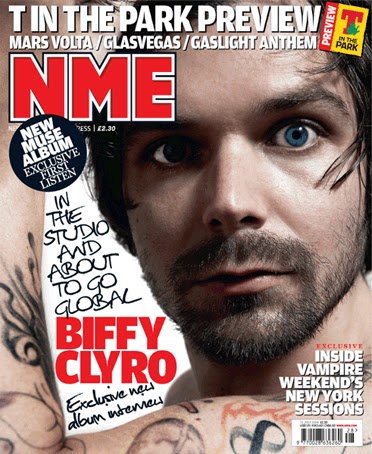
·         Images – In NME magazine they tend to use a popular artist on the front cover and it is also normally used as the background. The main image is always of the main band/artist mentioned on the cover and the image is large to draw the audience’s eye to it.
o   The image to the left is an example of NME’s weekly magazine and to the right is an example of their special edition magazines.
·         Mast Head – The mast head is situated in the top left corner of the magazine, it is bold and bright in order to stand out from the page and attract the audience to it. It is a bold red with a white and black outlines.
·         Colour Scheme – The magazines tend to use the main colours of red, white and black, however they do change the colour red sometimes when it’s a special edition magazine by replacing the colour with blue, pink and even orange depending on how well they go with the main image.
·         Text and its Layout
o    All the text is spread out around the main image so it doesn’t over power it.
o   The large text is to do with the main picture, it is the largest on the page apart from the mast head and is the same colour as the mast head as well.
o   They have put new music releases around the page along with information as to what’s inside.
o   The magazine also has and exclusive inside section to encourage the audience to read on.
·         Barcode – The barcode is usually situated at the bottom right of the page; however it can be placed else where on the page in order to make it fit in.

Contents page:
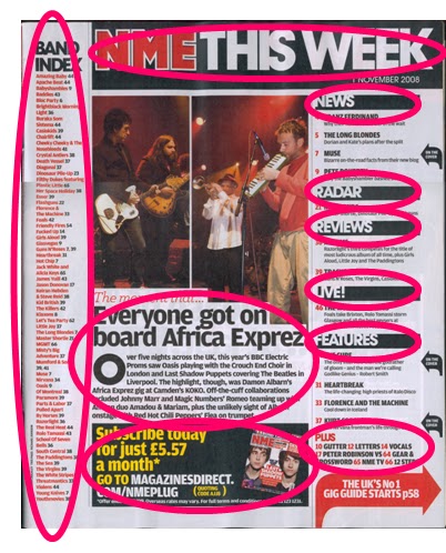
·         Images – There is only a handful of images on this contents page, the top two are from a concert, both of musicians playing there instruments. The bottom one is of an NME magazine, encouraging readers to subscribe.
·         Colour Scheme –The colours used on the page stick to the main colours used on the front cover, red, white and black.
·         Text and its Layout
o   The contents title is the same as the mast head on the cover but it has been extended and additional writing has been added, “This Week”.
o   Towards the far left there is a column with the title band index with is a bold black, underneath this there is a lot of small red writing, as it is small this indicated that its not the most important piece of writing on the page.
o   The writing which tells the reader what’s to be found in the magazine is to the right. This magazine has again decided to put the pages into sections which are, “News”, “Radar”, “Reviews”, “Live!” and so on.  Using section names that are straight to the point make it easier for the reader to find what they want in the magazine and it seems a more modern way of organising the contents instead of having them in order.
o   There’s some info from inside the magazine which is all black underneath the main two images. The title is a larger size than the writing and the writing starts with a drop-cap, showing the reader where to start reading.
o   There is also a section about subscribing to the magazine which has bright yellow and white writing that attracts the reader to it.

 Double page spread:

·         Images – The main image on the page is of Lily Allen who is leaning towards the reader and posing, this invites the reader to read on. It is the only image on the page and it is very large, so large in fact that it takes up one whole page.
·         Colour Scheme – The colour scheme sticks to the colours of red, white and black just like the front cover, the artists top also ties in with the magazines colour scheme.
·         Text and its Layout
o   The main title stands out from the page luring the audience in to read it. This is due to each letter having its own bold, black box with a contrasting white letter inside it. There is also a quote that Lily Allen has said to the magazine in the interview.
o   The main text is split into four columns on the first page and starts with a drop-cap showing the reader where to start reading/
o   The writing also has some of the main words in red in order to stand out, like the artists name.


Research of Kerrang! Magaine

Kerrang!
Kerrang! covers a large range of media. It owns a TV station, radio station and even hosts its own music festivals, however Kerrang! magazine only covers the music side of the media.
About the magazine:
·         Kerrang! targets its audience who prefer the genre of rock and heavy metal, therefore making it a strong competitor with the music magazine I intend to create.
·         Its name is onomatopoeic as it refers to the sound made when playing a power chord on an electric guitar.
·         The magazine is currently being edited by Nichola Browne and is published Bauer Media Group:
o   Bauer also own Q Magazine (which has been previously mentioned) and Mojo.
·         The magazine is released weekly on a Wednesday.
Codes and Conventions
Front cover:
·         Images – In Kerrang! they have used a well know lead singer for their main image which has been used as the magazines background. They have also situated other images of other members of well known bands around the main image.
·         Mast Head – The mast head is situated right across the top of the magazine, it is bold and stands out from all the other text on the page attracting the customer to the magazine.
·         Colour Scheme – The magazines main colours they use in almost every magazine are black and white, however they tend to vary their colours by using red, yellow, blue and even green on there magazines as well.
·         Text and its Layout
o    They have used small chunks of text around the front cover so they don’t over power the pictures.
o   The large text is to do with the main picture, the text is the largest seen on the cover (apart from the masthead) and is red in order to stand out but also stick with its colour scheme.
o   They have put quotes and insights to the magazine around the page all situated on top of or under there matching picture.
o   The magazine also includes a “plus!” section telling the audience what other bands and artists are included inside in case they are not a fan of Jared Leto.
·         Barcode – The barcode on Kerrang! tends to be situated on the bottom right corner of the magazine, however some issues have placed it else where on the page, like on the left at the top, underneath the mast head.


Contents page:
·         Images – There are many images on the contents page, all of different shapes and sizes.
o   At the top left they have an image of the editor of Kerrang!
o   Layered around the rest of the page are images of bands, singers, fans and there is also an image of the new muse album cover.
o   All the images have something to do with the inside of the magazine with either the artists performing, having a group photo or just having fun, which invites the reader to read on.
o   All the images also have page numbers on them to show the reader what page there on.
o   Al the bottom right there is also images of previous issues to encourage the reader to subscribe.
·         Colour Scheme – The contents have stuck to the colour scheme of white and black as on the front page. But this content also has the extra colour of yellow which is used a lot on the page.
·         Text and its Layout
o   The contents title is bold and eye catching. Underneath it Kerrang! has a quote from a reader with there name and age, this involves the reader more into the magazine.
o   At the top there is some writing from the editor of the magazine which has been sectioned off from the rest of the page. The writing is black and small, therefore showing that it’s not the most important piece of writing on the page.
o   The writing which tells the reader what’s to be found in the magazine is to the right. This magazine has decided to put the pages into sections of “News”, “Live Reviews”, “Gig Guide” and so on.  Using these catchy sections seems more modern and interesting, therefore encouraging the audience to read on.
o   There are also statements in bright yellow with black writing telling the reader about competitions and an “8 page review”. As its so bright it catches the audiences eye and encourages them to read it.
Double page spread:
·         Images – The main image on this page is of paramore’s lead singer performing in concert, it is used as the background and is very large, therefore attracting the audiences eye. There are also other images from the performance around the left side of the page, scattered around as if they were stuck onto a cork board. I also like the idea of having images of people who aren’t famous, but in fact fans from the night.
·         Logo – The Kerrang! logo is not on this double page spread, however there is instead a box in the top left hand corner that indicated the K’s rating scheme, five K’s being the best and one K the worst.
·         Colour Scheme – The colour scheme sticks to the colours of red, white and black just like the front cover, as well as an extra colour (green) to add more attraction to this page.
·         Text and its Layout
o   The main title is in white and is the largest and boldest writing on the page. Underneath is it has the second band the concert featured in green and is in smaller writing so it doesn’t draw too much attention away from the main targeted band. It also has the date and place the concert was held as well as K’s special five K (star) rating.
o   The main text on the first page, there is a statement which is highlighted green with white writing to intrigue the audience. Below this the writing is spilt into two columns with what looks like an extended drop cap of the first two words which is used to indicate where the reader is to start reading.
o   This double page also features a section were they have put what the fans have though of the night. The writing is to the far right and is in small white writing, each fans comment is under there own picture.
·         Features - It has extensive review and interview sections, featuring: new music releases, reissues, music complications, live concert reviews album reviews.
o   It uses a star rating system from one to five K’s.
·         It also contains weekly photos and posters for reader to have.