NME
NME (New Musical Express) covers a large range of media. It owns a TV station, radio station and even hosts its own gigs, tours and awards. NME also focuses on movies however I will only be focusing on the music.
About the magazine:
· NME’s music genre is a range of punk, gothic and rock music, therefore making it a possible competitor for my magazine.
· The magazine is currently being edited by Krissi Murison and is published by IPC Media.
o IPC also own the music and movie magazine, Uncut.
· The magazine is released on a weekly basis.
Codes and Conventions
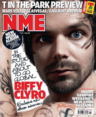
· Images – In NME magazine they tend to use a popular artist on the front cover and it is also normally used as the background. The main image is always of the main band/artist mentioned on the cover and the image is large to draw the audience’s eye to it.
o The image to the left is an example of NME’s weekly magazine and to the right is an example of their special edition magazines.
· Mast Head – The mast head is situated in the top left corner of the magazine, it is bold and bright in order to stand out from the page and attract the audience to it. It is a bold red with a white and black outlines.
· Colour Scheme – The magazines tend to use the main colours of red, white and black, however they do change the colour red sometimes when it’s a special edition magazine by replacing the colour with blue, pink and even orange depending on how well they go with the main image.
· Text and its Layout
o All the text is spread out around the main image so it doesn’t over power it.
o The large text is to do with the main picture, it is the largest on the page apart from the mast head and is the same colour as the mast head as well.
o They have put new music releases around the page along with information as to what’s inside.
o The magazine also has and exclusive inside section to encourage the audience to read on.
· Barcode – The barcode is usually situated at the bottom right of the page; however it can be placed else where on the page in order to make it fit in.
Contents page:
·
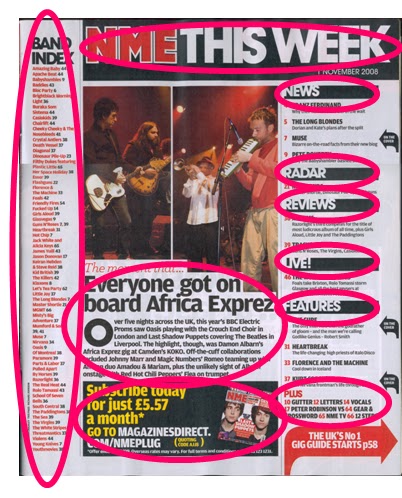
· Colour Scheme –The colours used on the page stick to the main colours used on the front cover, red, white and black.
· Text and its Layout
o The contents title is the same as the mast head on the cover but it has been extended and additional writing has been added, “This Week”.
o Towards the far left there is a column with the title band index with is a bold black, underneath this there is a lot of small red writing, as it is small this indicated that its not the most important piece of writing on the page.
o The writing which tells the reader what’s to be found in the magazine is to the right. This magazine has again decided to put the pages into sections which are, “News”, “Radar”, “Reviews”, “Live!” and so on. Using section names that are straight to the point make it easier for the reader to find what they want in the magazine and it seems a more modern way of organising the contents instead of having them in order.
o There’s some info from inside the magazine which is all black underneath the main two images. The title is a larger size than the writing and the writing starts with a drop-cap, showing the reader where to start reading.
o There is also a section about subscribing to the magazine which has bright yellow and white writing that attracts the reader to it.
Double page spread:
· Images – The main image on the page is of Lily Allen who is leaning towards the reader and posing, this invites the reader to read on. It is the only image on the page and it is very large, so large in fact that it takes up one whole page.
· Colour Scheme – The colour scheme sticks to the colours of red, white and black just like the front cover, the artists top also ties in with the magazines colour scheme.
· Text and its Layout
o The main title stands out from the page luring the audience in to read it. This is due to each letter having its own bold, black box with a contrasting white letter inside it. There is also a quote that Lily Allen has said to the magazine in the interview.
o The main text is split into four columns on the first page and starts with a drop-cap showing the reader where to start reading/
o The writing also has some of the main words in red in order to stand out, like the artists name.


No comments:
Post a Comment